Have you ever chosen a warm oak cabinet in a showroom, then found it grayish or orange at home? You are not imagining it. Many homeowners ask, “why does furniture color look different in store and home?” The answer usually involves lighting, surrounding colors, materials, and viewing conditions. A showroom may use bright LED lights with a cool or warm color temperature. Your living room may rely on daylight, lamps, or mixed bulbs. Each light source changes how wood grain, fabric, paint, and metal surfaces appear.
The room itself also affects perception. A beige wall can make a cream sofa look whiter, while dark flooring may deepen the appearance of walnut furniture. Glossy finishes reflect nearby colors, and textured fabrics create small shadows that shift throughout the day. Professional designers often compare furniture samples under several light sources before making a final decision. Photographing the piece can help, but cameras and phone screens may distort color too. In my experience, even a carefully checked sample can look slightly different after delivery. That possibility deserves attention. Color matching is not always exact.
This guide examines the practical reasons behind these changes. It also explains how to test furniture at home, read manufacturer color descriptions, and reduce disappointment before purchasing. Reliable retailers should provide material details, finish information, and realistic photographs. Still, every room has its own visual conditions. That makes personal testing essential. Small differences matter.
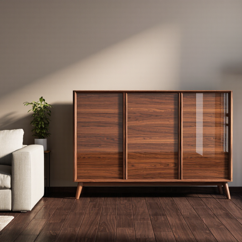
Why Does Furniture Color Look Different in Store and Home?
How Lighting Conditions Change Furniture Color Perception
A sofa can look warm in a showroom and cooler in your living room. The reason is often lighting, not the furniture itself. Showrooms usually use bright ceiling lights with carefully chosen color temperatures. At home, daylight, lamps, wall colors, and flooring change the visual result. Even white walls can reflect soft blue or yellow tones onto nearby fabric. Small shifts matter.
I once inspected a beige chair under warm bulbs and found it slightly pink. Near a north-facing window, it appeared gray and quieter. This was not a furniture defect. It was a viewing condition. Light sources also differ in color rendering, commonly measured by CRI. Higher CRI lighting generally reveals fabric and wood tones more naturally. Still, CRI is not a perfect guarantee. A surface may look accurate under one lamp and unexpected under another.
Before ordering, view samples at several times of day. Check them beside your walls, curtains, and floor. Move the sample into direct sunlight, shade, and evening lamp light. Do not trust one photograph. I also recommend checking the finish from different angles, because gloss can create bright reflections that distort color. My own color judgments are not always consistent, especially after staring too long. A short break helps. Testing at home may feel less dramatic, but it gives a more dependable impression.
| Lighting Condition | Typical Illuminance | Typical Color Temperature | Typical Color Rendering | Common Furniture Color Impression | Why the Appearance Changes | Practical Comparison Tip |
|---|---|---|---|---|---|---|
| Warm residential LED lighting | 100–300 lux | 2,700–3,000 K | CRI 80–95 | Warm, creamy, golden, or slightly darker | The light contains more long-wavelength red and yellow energy, which can reinforce warm undertones in wood, beige, tan, and brown finishes. | View samples under the same warm bulbs used in the room. |
| Neutral residential LED lighting | 200–500 lux | 3,500–4,000 K | CRI 80–95 | More balanced and closer to a neutral showroom appearance | A more balanced spectrum reduces the visual emphasis on either warm or cool undertones, although the result still depends on the finish and light source quality. | Use neutral lighting when checking whether a color is visually balanced. |
| Cool white retail lighting | 300–750 lux | 4,000–5,000 K | CRI 80–90+ | Cleaner, brighter, slightly cooler, or more gray | Higher color temperature and stronger illumination can make cool undertones more noticeable and increase perceived contrast on textured surfaces. | Do not judge a finish only under bright cool retail lighting. |
| Warm retail spotlighting | 500–1,000 lux on the display | 2,700–3,500 K | CRI 90+ | Richer, warmer, more saturated, and more dramatic | Directional light creates highlights and shadows, while the warm spectrum can enhance reds, oranges, honey tones, and natural wood grain. | Inspect the item away from the spotlight and compare it with a flat sample. |
| Indirect daylight near a window | 300–1,000 lux | 4,000–6,500 K | Generally broad-spectrum | More neutral, cooler, or slightly less yellow | Daylight varies with weather, time, window direction, and surrounding surfaces. Blue skylight can make warm finishes appear less warm. | Check the furniture at the same time of day and under similar weather conditions. |
| Direct midday sunlight | 10,000–100,000 lux outdoors; lower indoors | Approximately 5,000–6,500 K | Broad-spectrum | Brighter, higher contrast, and sometimes less saturated in highlights | Strong illumination reveals surface texture and gloss. Specular reflections can temporarily mask the actual finish color. | Compare color in both sunlit and shaded areas before making a decision. |
| Low-light evening environment | 50–150 lux | Usually 2,700–3,000 K | CRI 80–95 | Darker, softer, and less detailed | Low illuminance reduces visual sensitivity to subtle hue and texture differences, while warm lamps can shift the overall appearance toward yellow or red. | Use a larger sample and assess it at the intended evening brightness. |
| Low-CRI or narrow-spectrum lighting | 100–750 lux | 2,700–6,500 K | CRI below 80 | Muted, uneven, or unexpectedly tinted | Missing or weak parts of the visible spectrum can reduce the accuracy of reds, greens, blues, and complex wood tones. | Prefer lighting with CRI 90 or higher when evaluating furniture color. |
Note: Illuminance, color temperature, and color-rendering values are typical reference ranges. The perceived result also depends on the furniture material, surface gloss, surrounding wall colors, viewing angle, and visual adaptation.
Lighting, walls, flooring, and nearby furniture change how color reaches your eyes. A beige sofa may look creamy in a showroom but gray beside a white wall. Light changes everything.
Direct sunlight can make colors look brighter and warmer. Shade, especially near a north-facing window, may make them appear cooler and quieter. Check both conditions.
Warm bulbs emphasize yellow and red tones. Cool daylight can highlight blue and gray tones. A room may shift noticeably between afternoon and evening.
Higher CRI lighting usually reveals materials more naturally. However, it cannot guarantee perfect color accuracy under every lamp. I still treat it as helpful guidance, not proof.
Glossy finishes create bright reflections that can make surfaces look lighter. Brushed wood and textured fabric form tiny shadows under side lighting. Matte finishes usually appear steadier.
Request a large material sample when possible. Place it beside your wall, curtains, flooring, and existing furniture. View it near a window and under evening lights.
Small edges receive more light than a full cabinet or sofa. A larger surface may look darker or less even. I have misjudged this myself.
Inspect it in natural light before removing all packaging. Compare it with the approved sample, not only online images. Take photos using consistent lighting.
Not reliably. Camera settings, screens, and room lighting can alter the result. Use photos as records, not final evidence.
Look from different angles and about two meters away. Compare the sample at several times of day. Take a short break. Staring too long can make my judgment inconsistent.
Why does furniture color look different in store and home? The answer often lies in the surrounding environment. Store lighting may be bright, cool, and carefully arranged, while home lighting can be warmer, dimmer, or influenced by natural sunlight at different times of day. Paint colors, flooring, walls, curtains, and nearby objects also reflect light onto furniture, subtly changing how its color is perceived.
Material, finish, and texture play an equally important role. Glossy surfaces reflect more light, while matte fabrics and textured wood may absorb it, making colors appear lighter, darker, warmer, or softer. Store displays are usually designed to highlight furniture under controlled conditions, whereas home settings include different room sizes, shadows, and color combinations. To make a better comparison, view samples or furniture in both daylight and artificial light, place color swatches near your walls and flooring, and check the item from different angles before and after purchase.

 Ambrose Home